30 Sep 2019
Sobre tu bebé
Cuando una gestante acude a un control obstétrico ecográfico, es muy habitual que el médico le hable del percentil del peso fetal, y este es un concepto que, en ocasiones, cuesta entender. Las mamás que ya tienen hijos mayores, lo conocen a la perfección, ya que los pediatras lo emplean continuamente, pero si es el primer embarazo, quizá cueste un poco interpretar esa información. Vamos a intentar explicarlo de la forma más clara posible.
Un percentil es un concepto estadístico, una de las llamadas medidas de posición central utilizadas en esta disciplina. Indica, una vez ordenados los datos de menor a mayor, el valor de la variable por debajo del cual se encuentra un porcentaje dado de observaciones en un grupo de observaciones. Con un ejemplo lo entenderéis mejor: el percentil 30 es el valor bajo el cual se encuentran el 30 por ciento de las observaciones del grupo.
Durante el embarazo, se utilizan multitud de percentiles, pero los que más preocupan a los futuros papás son los de crecimiento fetal. Como al feto no se le puede pesar ni medir directamente, ya que está dentro del útero, se realizan varias mediciones de diferentes partes de su cuerpo para después estimar el peso fetal. Así se realizan de manera estandarizada las medidas de diámetro biparietal (cabeza), circunferencia abdominal (abdomen) y longitud del fémur (pierna). Con todo ello, podremos calcular un peso fetal aproximado.
Cada una de estas medidas, tiene su correspondiente tabla estandarizada de percentiles, de tal forma que podemos valorar si el crecimiento fetal está siendo el adecuado. Estas medidas se suelen toman a partir de la semana 14, ya que antes se utiliza otro tipo de medida para valorar el tamaño del embrión: el CRL o longitud craneocaudal.
Todos los valores incluidos entre el percentil 10 y el percentil 90, se consideran normales, y los que sean menores del 10 o mayores del 90, requerirán de una vigilancia un poco más especial. Por ejemplo, un percentil 30, que está por debajo de la media, es igual de normal que uno que esté por encima, por ejemplo un 70. Debemos tener presente que esto son pesos estimados, y que pueden variar del real hasta en un 15-20% (hacia arriba o abajo).
La valoración del percentil una vez tenemos la estimación del peso del feto, hay que realizarla en base a la edad gestacional real. Este concepto es importante, ya que a veces hay variación entre la fecha de última regla de la gestante, y la fecha de la última regla calculada por la ecografía del primer trimestre, prevaleciendo esta última sobre la anterior. El cálculo de percentil en base a una fecha de última regla indebida, en ocasiones da lugar a sustos importantes de los futuros papás.
Cuando el percentil de peso fetal está por encima de 97, lo denominamos “feto grande para la edad gestacional” (peso extremadamente alto), y cuando es menor de 10 lo llamamos “feto pequeño para la edad gestacional”. Cuando es igual o menor a 3 estamos ante una “restricción del crecimiento fetal” o “CIR” (peso extremadamente bajo). Estos casos requieren una vigilancia especial durante el embarazo, que indicará el obstetra.
Tras el nacimiento del bebé, continuaremos con los percentiles varios años más. Estos serán los percentiles pediátricos, y los más utilizados son los de peso y talla. También sirven para valorar la normalidad del crecimiento del niño hasta la edad adulta. Por todo ello os decía al principio del “post”, que si este concepto os resultaba aún desconocido, en poco tiempo se iba a convertir en algo muy familiar.
Dra. Elisa García
Especialista en Ginecología y Obstetricia del Hospital Clínico San Carlos (Madrid)
Como interpretamos los percentiles del bebé por ecografía
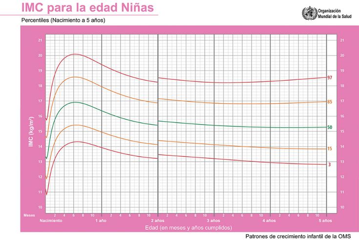
Los percentiles son representaciones gráficas y de vital importancia porque nos indican la edad, la estatura, el perímetro cefálico y el peso del niño o de la niña, aunque las más usadas son las de la talla y el peso, y se rigen por números: 3, 10, 25, 50, 75, 90 y 97. El más bajo es el percentil 3, y el más alto, el 97.
Además de la ecografía emocional, donde observamos al bebé para obtener imágenes de recuerdo, las ecografía convencionales proporcionan información vital.
La talla, el peso y el perímetro cefálico son los principales parámetros que el pediatra vigilará para comprobar que todo se desarrolla normalmente con arreglo a la edad y al sexo de tu pequeño. Estas medidas se rigen por las denominadas curvas de crecimiento, cuya interpretación se realiza mediante los percentiles.
La matrona es la encargada de interpretar los llamados percentiles. Es propicio que tu bebé gane peso y estatura, indica que tu bebé se desarrolla correctamente de acuerdo a su edad.
La primera ecografía se debe realizar entre la semana 4 y 8 de embarazo. El bebé medirá unos 3 centímetros en la semana 4 y, 6 cm en la semana 8, según los percentiles.
Entre la semana 9 y la 15 crecerá unos 8 centímetros y ya se pueden establecer medidas más aproximadas de cada parte de su cuerpo porque está más formado. Índices alentadores para el desarrollo de tu bebé.
Si tu futuro bebé tiene percentil 50 significa que de cada 100 fetos, 50 pesan y miden menos que él, y otros 50, más. Es decir que está nivelado en la tabla. Se considera normal cualquier percentil por encima de 10 y por debajo de 90. En cualquiera de estos dos casos se trata de complicaciones graves que deberán ser tratadas.
Principales características de los llamados percentiles
Como habéis podido comprobar, los percentiles son de gran ayuda para la matrona ya que aporta información importante sobre el desarrollo del bebé y su estado de salud.
Microsoft Support Services
Excel for Microsoft 365 Excel for Microsoft 365 for Mac Excel for the web Excel 2021 Excel 2021 for Mac Excel 2019 Excel 2019 for Mac Excel 2016 Excel 2016 for Mac Excel 2013 Excel 2010 Excel 2007 Excel for Mac 2011 Excel Starter 2010 More.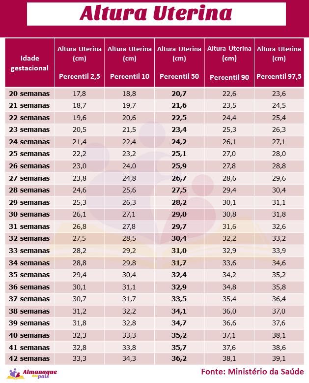 ..Less
Returns the kth percentile for the values in the interval. This function is used to determine the acceptance threshold. For example, you may decide to examine only those candidates who score more than 90th percentile.
Important:
This function has been replaced by one or more new functions that provide greater precision and have names that better reflect their purpose. Although this feature is still used for backwards compatibility, it may not be available in future versions of Excel, so we recommend using the new features.
For more information about the new features, see PERCENTILE.EXC Function and PERCENTILE.INC Function.
PERCENTILE(array;k)
The PERCENTILE function has the following arguments.
K Mandatory. Percentile value between 0 and 1, including these numbers.
If k is not a number, returns #VALUE! #VALUE! error value.
If k < 0 or k > 1, PERCENTILE returns the #NUM! error value.
If k is not a multiple of 1/(n – 1), the PERCENTILE function interpolates to determine the value of the kth percentile.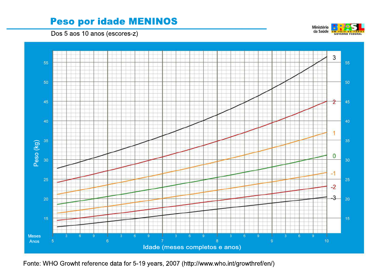
In this example, we see the 30th percentile of the list in cells E2:E5.
You can always ask the Excel Tech Community a question or ask for help in the Answers community.
Clients often ask us about the p99 metric (99th percentile).
This is definitely a reasonable request and we plan to add this functionality to VividCortex (more on that later). But at the same time, when clients ask about it, they mean something very specific—something that could be a problem. They’re not asking for the 99th percentile on some metric, they’re asking for 99th percentile metric . This is common for systems such as Graphite, but all this does not give the result that is expected from such systems.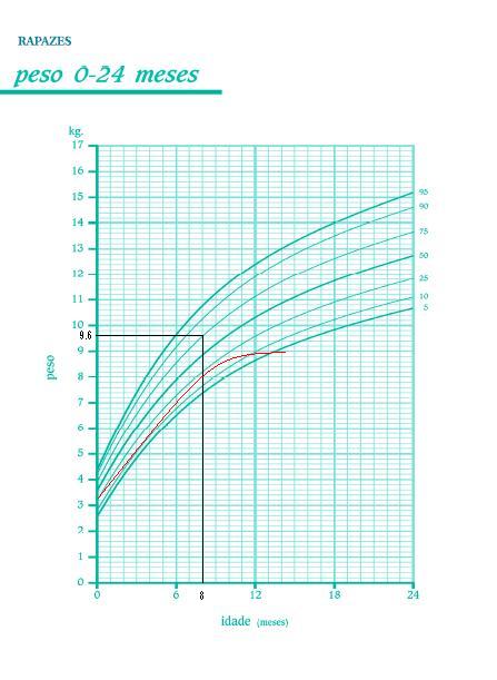 This post will tell you what you may have wrong about percentiles, the exact extent of your confusion and what you can still do right in this case.
(This is a translation of an article written by Baron Schwartz.)
In the last few years, a lot of people have started talking at once about the fact that there are a number of problems in monitoring by averages. It is good that this topic has now become actively discussed, since for a long time the average values of parameters in monitoring were generated and accepted without any close analysis.
Averages are a problem and don’t help much when it comes to monitoring. If you’re just looking at averages, you’re likely to miss the data that has the most impact on your system: when looking for any problems, events that matter most to you are, by definition, outliers. There are two problems with averages when there are outliers:

So when you average any metric in a system with errors, you combine all the worst: you observe a system that is no longer quite normal, but at the same time you do not see anything unusual.
By the way, the work of most software systems is simply teeming with extreme outliers.
Looking at outliers in the long tail by frequency of occurrence is very important because it shows you exactly how badly you’re handling requests in some rare cases. You won’t see this if you only work with averages.
As Amazon’s Werner Vogels said at the opening of re:Invent: The only thing averages can tell you is that you’re serving half your customers worse. (Although this statement is absolutely correct in spirit, it does not quite reflect reality: here it would be more correct to say about the median (aka the 50th percentile) – it is this metric that provides the specified property)
Optimizely published an entry in this post a couple of years ago back.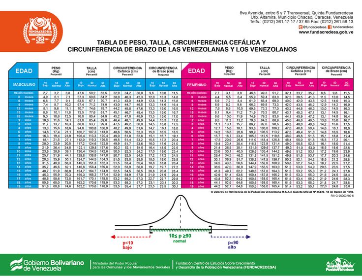 She perfectly explains why averages can lead to unexpected consequences:
“Although averages are very easy to understand, they can also be very misleading. Why? Because monitoring the average response time is like measuring the average temperature of a hospital. While what really concerns you is the temperature of each of the patients and especially which of the patients needs your help in the first place.”
Brendan Gregg also explained it well:
“As a statistic, averages (including the arithmetic mean) have many advantages in practical applications. However, being able to describe the distribution of values is not one of them.”
Percentiles (quantiles in a broader sense) are often touted as a means to overcome this fundamental shortcoming of averages. The point of the 99th percentile is to take the entire data set (in other words, the entire collection of system measurements) and sort them, then discard the largest 1% and take the largest value from the remaining ones. The resulting value has two important properties:
Of course, you don’t have to choose the 99%. Common variations are the 90th, 95th, and 99.9th (or even more nines) percentiles.
And now you’re assuming: averages are bad, percentiles are great – let’s compute percentiles from metrics and store them in our time series data warehouse (TSDB)? But everything is not so simple.
There is a big problem with percentiles in time series data. The problem is that most TSDBs almost always store aggregated metrics over time, rather than the entire sample of measured events.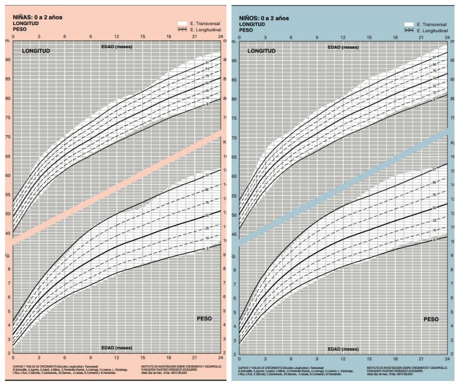 Subsequently TSDB average these metrics over time in a number of cases. The most important ones are:
And here comes the problem. You are again dealing with averaging in some form. Percentile averaging does not work because you must have a full sample of events to calculate the percentile at the new scale. All calculations are actually incorrect. Averaging percentiles doesn’t make any sense. (The implications of this can be arbitrary. I’ll come back to this later. )0003
)0003
Unfortunately, some common open-source monitoring products encourage the use of percentile metrics, which will actually be resampled on save. For example, StatsD allows you to calculate the desired percentile and then generates a metric with a name like foo.upper_99 and periodically throws them off for saving in Graphite. Everything is fine if the time discreteness does not change during viewing, but we know that this still happens.
It is very common to misunderstand how all these calculations work. Reading the comment thread on this StatsD GitHub ticket illustrates this perfectly. Some comrades there talk about things that have nothing to do with reality.
— Susie, what is 12+7?
– A billion!
– Thanks!
“…uh, but that can’t be true, can it?”
– she said the same thing about 3 + 4
Perhaps the shortest way to describe the problem would be to say this: Percentiles are calculated from a collection of measurements and must be recalculated in full every time this collection changes.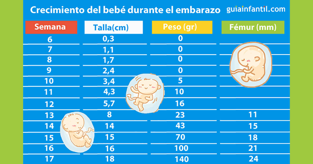 TSDB periodically average data over different time intervals, but at the same time do not store the original sample of measurements.
But, if the calculation of percentiles does require a full sample of the original events (for example, each time each web page is loaded), then we have a big problem. The problem of “Big Data” – it would be more accurate to say so. That is why the truthful calculation of percentiles is extremely expensive.
There are several ways to calculate *approximate” percentiles which are almost as good as storing a full sample of measurements and then sorting and calculating them. You can find a lot of research in various fields including: (or baskets) and after that calculate exactly how many events fall into each of the ranges (baskets)
The essence of most of these solutions is to approximate the distribution of the collection in one way or another. From the distribution information, you will be able to calculate approximate percentiles, as well as some other interesting metrics. Again from the Optimizely blog, there is an interesting example of the distribution of response times, as well as the average and 99th percentile:
There are many ways to calculate and store approximate distributions, but histograms are especially popular because of their relative simplicity. Some monitoring solutions support histograms. Circonus, for example, is one of those. Theo Schlossnagle, CEO of Circonus, writes frequently about the benefits of histograms.
Ultimately, having the distribution of the original collection of events is useful not only for calculating percentiles, but also for revealing some things that percentiles cannot say. After all, a percentile is just a number that just tries to represent a lot of information about the data. I won’t go as far as Theo did when he tweeted that “99th is no better than average” , because here I agree with percentile fans that percentiles are much more informative than averages in representing some important characteristics of the original sample.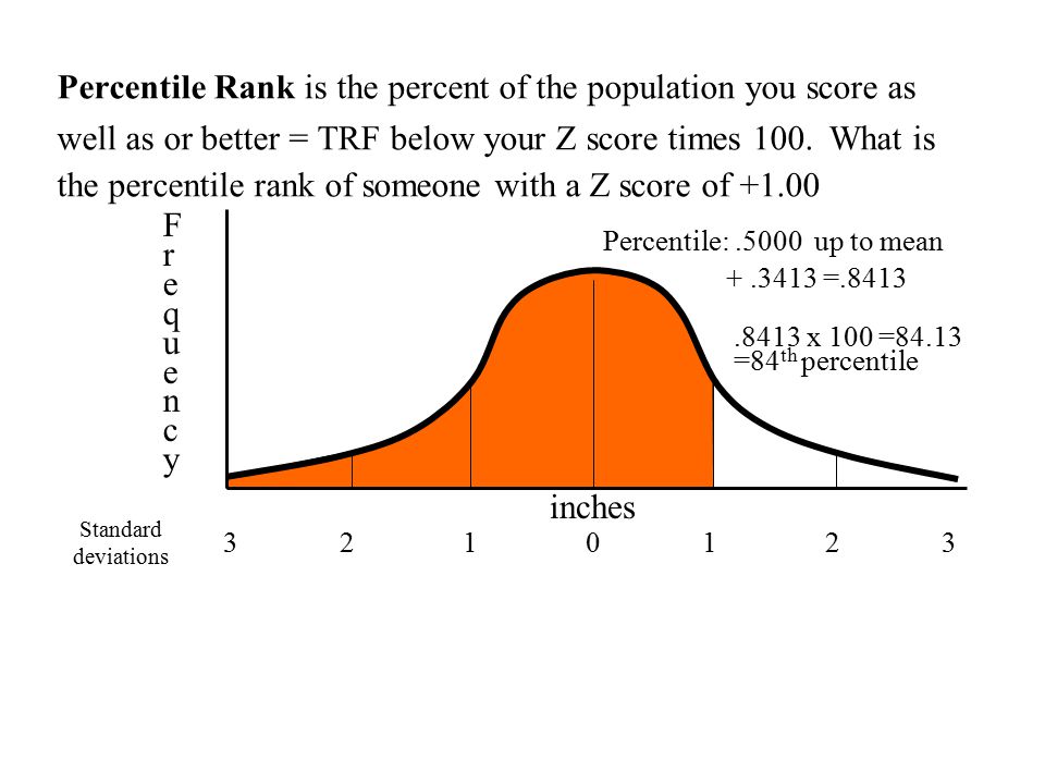 However, percentiles do not tell you as much about the data as more detailed histograms. The illustration from Optimizely company above in the text contains an order of magnitude more information than any single number can do.
The best way to calculate percentiles in TSDB would be to collect range metrics. I made this assumption because a lot of TSDBs are really just key-value collections sorted by timestamps without the ability to store histograms.
Range metrics provide the same functionality as a sequence of histograms over time. All you need to do is select the limits that will divide the values into ranges, and then calculate all the metrics separately for each of the ranges. The metric will be the same as for the histogram: namely, the number of events whose values fell into this range.
But in general, the choice of ranges for splitting is not an easy task. Typically, ranges with logarithmically progressive sizes or ranges that store coarse values to speed up calculations (at the cost of not growing counters smoothly) will be a good choice.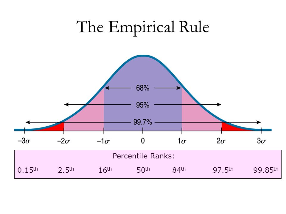 But ranges with the same dimensions are unlikely to be a good choice. For more information on this topic, see this post by Brendan Gregg.
There is a fundamental contradiction between the amount of data stored and its degree of accuracy. However, even a rough distribution of ranges provides a better representation of the data than the average. For example, the Phusion Passenger Union Station shows latency band metrics across 11 bands. (I don’t think the above illustration is illustrative at all; the y-value is somewhat confusing, it’s actually a 3D plot projected to 2D in a non-linear way. However, it still gives more information than an average would give.)
How can this be done with popular open-source products? You have to define ranges and create stacked columns like in the picture above.
But calculating the percentile from this data will now be much more difficult. You will need to go through all the ranges in reverse order, from largest to smallest, summing up the event counters along the way. As soon as you get the sum of the number of events greater than 1% of the total, then this range will store the value 99% percentile. There are many nuances here – non-strict equalities; how exactly to handle edge cases, what value to choose for the percentile (range above or below? or maybe in the middle? or maybe weighted from all?).
In general, such calculations can be very confusing. For example, you might think that you need 100 ranges to calculate the 99th percentile, but the reality may be different. If you have only two ranges and 1% of all values fall into the top, then you can get 99% percentile and so on. (If this sounds strange to you, then think about quantiles in general; I think that understanding the essence of quantiles is very valuable.)
So it’s not all that simple. This is possible in theory, but in practice it depends heavily on whether the repository supports the required types of queries to obtain approximate percentile values for range metrics. If you know the repositories in which this is possible – write in the comments averaging and resampling) all range metrics are absolutely robust to these types of transformations. You will get correct values because all calculations are commutative with respect to time.
A percentile is just a number, just like an average. The mean shows the center of mass of the sample, the percentile shows the top level of the specified proportion of the sample. Think of percentiles as the traces of waves on a beach. But, although the percentile displays the upper levels, and not just the central trend as an average, it is still not as informative and detailed as compared to the distribution, which in turn describes the entire sample.
Meet there are heat maps – which are actually 3D graphs in which the histograms are rotated and aligned together over time, and the values are displayed in color. Again, Circonus provides a great example of heat map visualization.
On the other hand, as far as I know, Graphite does not yet provide the ability to create heat maps based on range metrics. If I’m wrong and it can be done with some trick, let me know.
Heatmaps are also great for displaying shape and latency density in particular. Another example of a latency heatmap is the streaming delivery summary from Fastly.
Even some ancient tools that seem primitive to you can create heat maps. Smokeping, for example, uses shading to show ranges of values. Bright green indicates medium:
Well, after all the mentioned complexities and nuances to consider, maybe the good old StatsD metric upper_99 for showing percentiles does not seem so bad to you. In the end, it is very simple, convenient and ready to use. Is this metric really that bad?
It all depends on the circumstances. They are great for many use cases. I mean, anyway, you are still limiting yourself to the fact that percentiles don’t always describe the data well. But if that doesn’t matter to you, then your biggest problem is oversampling these metrics, which means you’ll be watching for bad data afterwards.
But measurements are generally a wrong thing – in any case, and besides, a lot of things that are essentially wrong are still somehow useful. For example, I could tell you that a good half of the metrics that people look at are actually already deliberately distorted. For example, the load average for systems is indicative. This parameter is undeniably useful, but once you know exactly how this “sausage” is made, you may experience a shock at first. (There is an excellent article on Habré about calculating LA – note trans. ) Likewise, many systems similarly condense various metrics of their performance. A lot of the metrics from Cassandra are the result of the Metrics library (Coda Hale) and are actually floating averages (exponentially weighted floating averages) that a lot of people have a strong aversion to.
But let’s get back to percentile metrics. If you save the p99 metric and then scale it down and look at the averaged version over a long period of time – although this may not be “correct” and it may even be that the graph will be very different from the real value 99th percentile, but being wrong doesn’t necessarily mean that this chart can’t be used for the intended purpose, which is to understand the worst cases in user interactions with your app.
So it all depends on the case. If you understand how percentiles work and that it’s wrong to average percentiles, and you’re happy with that, then storing percentiles can be valid and even useful. But here you introduce a moral dilemma: with this approach, you can greatly confuse unsuspecting people (perhaps even your colleagues). Look at the comments on the ticket on StatsD again: the lack of understanding of the essence of the process is directly felt.
Let me give you a not-so-great analogy: I sometimes eat foods from my refrigerator that I would never offer to others. Just ask my wife about it. (The author’s wife – approx. trans. ). If you give people a bottle labeled “alcohol” and it contains methanol, those people will go blind. But some will ask: “what kind of alcohol is contained in this bottle?” You better take the same measure of responsibility in relation to such matters.
Currently our TSDB does not support histograms and we do not support calculating and saving percentiles (although you can just send us any of your metrics if needed).
In the future, we plan to support the storage of high-resolution range metrics, that is, metrics with a large number of ranges. We will be able to implement something like this since most of the ranges will probably be empty and our TSDB will be able to handle sparse data efficiently (it is also likely that after averaging over time it will no longer be so sparse – note trans. ). This will give us the ability to output histograms once per second (all of our data is stored at a resolution of 1 second). The range metrics will be resampled to 1-minute resolution after the period set in the settings, which is set to 3 days by default. In this case, the range metrics will be resampled to 1-minute resolution without any mathematical problems.
And finally, from these range metrics, we will get the ability to get any desired percentile, show the error estimate, show the heat map and show the distribution curve.
This will not be quick to implement and will require a lot of effort from engineers, but work has begun and the system has already been designed with all this in mind. I cannot promise when exactly this will be implemented, but I consider it necessary to tell about our long-term plans.
The post turned out to be somewhat longer than I originally intended, but I touched on a lot of topics.
I hope all of this was helpful to you.